
Improving the WPT Dashboard
Thoughts on things I'd like to see as part of the WPT dashboard.
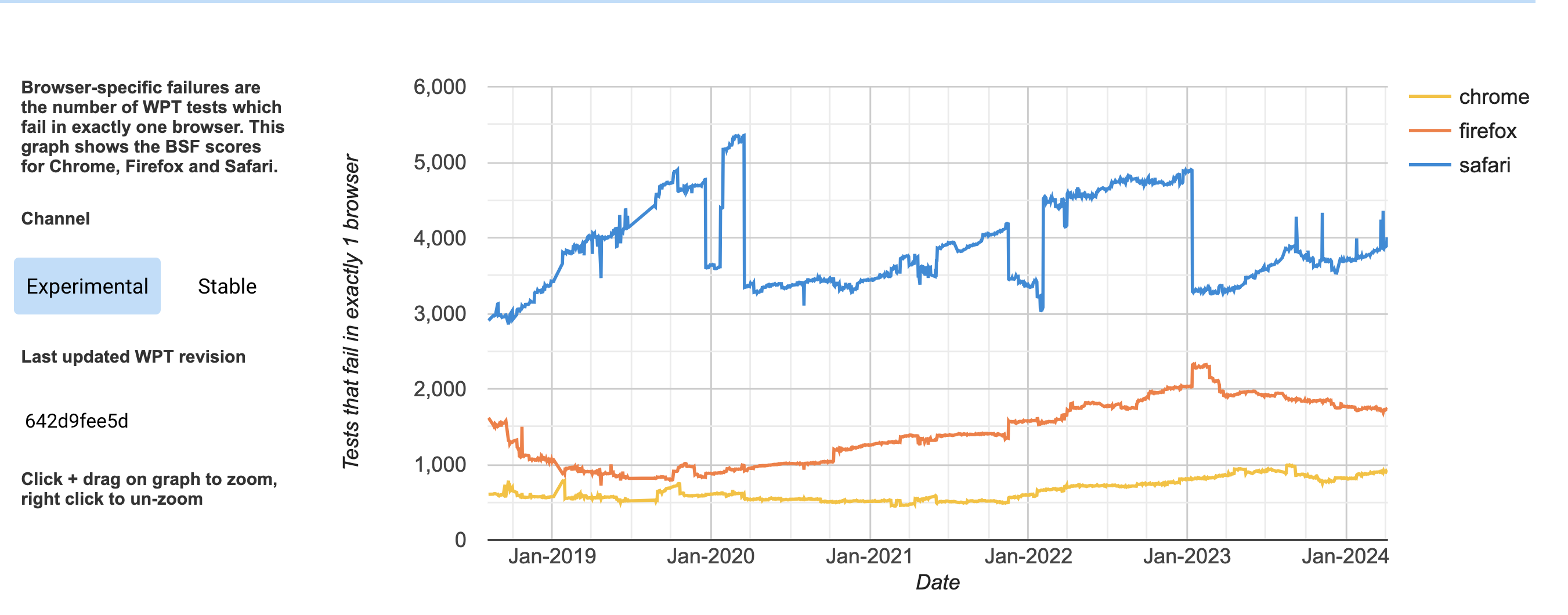
In my last post I dug into the data behind wpt.fyi's Browser Specific Failures chart (below) and the site's general reporting capabilities.
I suggested that linking to data on specifically what failed (at least what is queryable) would probably be really helpful (perhaps some kind of "understanding this chart" link as well).
While these aren't part of the design today, I think this is mainly because the primary audience of that chart was originally mainly the vendors themselves. It was intended to allow for certain simple kinds of tracking, planning and prioritization. For example "Let's set a goal to not let the failure exceed such and such threshold" or "Let's aim to lower the failures by X this quarter". It wasn't critical to link to the tests because the audience knew how to interrogate the data - the purpose was just to get a quantifiable number you can easily report on.
But, now we see this chart shared a lot and it's pretty clear that people are curious so we should probably adjust it for the wider audience.
Additionally though, that's also only a single view of the data, and I'd like to argue that we could some other improvements too.
Prioritization
BSF made the observation that if we can identify a test that fails in only 1 browser, then that browser's team can easily prioritize something that has significant impact. That browser is the boat anchor holding things back. Except, it's not quite that cut and dry in reality.
Real management of software projects is hard. I think that anyone who's worked on software projects can relate to this, at least a bit, if we take some time to consider all of the things that go into choosing how to apply our limited resources. Obviously, not all failures are equal - especially when we're talking about projects which are a quarter of a century old. The reality is that all of that decisioning and prioritization is happening independently across different organizations, with different views on the web, different budgets, different legacy challenges, etc.
That's where I think there are some things to learn from Interop.
What I learned from Interop Is...
If you think about it, Interop is about trying to achieve thematically, basically the same thing as BSF: Make more things "green across the board". But it is a very different thing than BSF.
I've really learned a lot from the process of helping organize Interop every year about why this takes so long to happen naturally. There are so many limits and signals and opinions. One of the things we do as part of the process is to take all of the submissions and independently order them in terms of what we think are their priorities. There are 6 organizations doing that: Apple, Bocoup, Google, Igalia, Microsoft and Mozilla. How many do you think chose the same #1? The answer is 0.
It really highlights how waiting for all of the stars to align by chance winds up often being a painfully slow process and full of problems.
However, a huge part of interop is dedicated to dealing with the stuff BSF doesn't really consider - aligning agreement on: 1. what features are most important 2. which tests regarding those are valid/important 3. are all the spec questions really answered? 4. is this actually (hopefully) achievable in the next year?
In that, I believe it has been extremely successful in creating way more "green across the board" than anything else. I think this is true beyond even what is officially part of Interop, because we're all able to kind of discuss and see where others are probably going to invest in work because things that were important for them didn't make the cut.
In a way, each year is sort of like doing what we used to do with "CSS2" and "HTML4"... Creating a more focused discussion that is the goal floor, not the ceiling.
It's not enough...
Sure, I believe this gives us much better results by helping alignment. I think this is obvious given how rapid and smoothly we've found so much high-quality alignment in recent years. However, there's something I want stress in all of this: Choosing what to prioritize is also inherently choosing what to collectively deprioritize. It is inevitable because at the end of the day there is just too much.The only real solution to this problem is wider investment in the platform and, ultimately, almost certainly, changing how we fund it.
Alignment vs Passing
Interop also showed us that a simple, individual pass/fail can be incomplete and misleading. If 3 browsers reach a point of passing 50% of measured tests, the number of tests that pass in all browsers might actually be 0, as illustrated in the table below...
| Chrome | Firefox | WebKit |
|---|---|---|
| ✅ | ✅ | |
| ✅ | ✅ | |
| ✅ | ✅ | |
| ✅ | ✅ | |
| ✅ | ✅ | |
| ✅ | ||
| ✅ | ||
| ✅ | ||
| ✅ | ||
| ✅ |
In fact, here's a real world example of exactly this kind of misleading view in a set of SVG tests. If we look at the numbers across the bottom:
- chrome: 166 / 191
- edge: 166 / 191
- firefox: 175 / 191
- safari: 132 / 191
It's not terrible if you're only looking at those numbers. But, if you scroll down through that table you'll see that there are ragged failures all over that. In fact, only 52 of 189 are "green across the board"!
We can only realistically solve by having a more holistic view and working together. BSF is just the slice that is theoretically actionable individually, not everything that matters.
What about a focus on Universally Passing?
In the Interop project we track the difference above as its own data point: The Interop number, and we put it as a separate column in the test tables:
Similarly, we track it over time:
Could we learn something from this? Wouldn't something like that be great to have in general?
For example, in the wpt.fyi tables? Now, it couldn't look just like that because those numbers are all in percentages, and this only really works because the interop process carefully sets a governance process for defining/agreeing to what the tests are. It would be enough to add a column to the table in the same form, something like this:
That might help us uncover situations like the SVG one above and present opportunites like interop for us to collectively decide to try to address that.
Similarly, we could track it over time. Sort of the opposite of BSF. We want to see the simple number of subtests passing in browsers and it should always be going up (even as new tests are added, no existing ones should stop passing - those are just more opportunities to go up). Further, ideally the Universally Passing number shouldn't ever be drawing significantly further away from that over time or we're making less of the platform universal. That is, you could see, over time when we are cooperating better, and when we are not.
We do better when we are. In my mind, that's an explicit goal, and this would be a view into it.