
Design Affordance Controls
We often use a single word (the actual word varies) to discuss "controls" . This, I believe, carries with it a fundamental assumption that they are all somehow "the same," and that has shaped how we think about them. In this post I'll explain why I have recently come to think that perhaps they aren't really quite the same at all. I'll also suggest that some additional terminology which could describe a few broad classes of controls, could help us better discuss (and perhaps shape) them.
What is a "control", exactly?
On its face, it seems like kind of an absurdly simple question, right?
However, consider this: Many UI toolkits outside the web have, at some point, explicitly defined some kind of control which could be described as "a container with scrollbars". In a way, this makes sense: When something is scrollable, there are several UI implications:
- They paint scroll bars and mouse/touch affordances.
- They become part of the sequential focus order.
- Standard keyboard control affordances for managing the scroll are added.
- There are events and UI states to track.
- They might gain an affordance to become user-sizable.
- ...and so on.
On the web, we don't look at the problem that way. There is no special "scroll container" element, nor even an ARIA role for it. Instead, elements are, first, just "Good Semantic Content", and whether they are scrollable (or not) is considered a matter of, and subject to, the design. Overflow, and affordances related to it, are decidedly presentational.
This is pretty interesting because, for example, authors can choose when a <section> should be "component-like" with affordances or not - they vary in pursuit of good design.
Form controls, on the other hand, are definitely not like that at all. Their entire nature is to always be a particular control. As we look to introducing new "controls" in HTML, I think it could be helpful to think about this sort of distinction.
"Design Affordance Controls"
I would like to argue that there are several other "common controls" (collapsible content, tabs and accordions are some examples) which have more in common with scrollable areas than they do with form controls, and that this might be worth careful consideration.
While these components aren't simply about "overflow" (they manage actual hiddenness and have ARIA roles), they do seem to share a lot of other qualities with scroll containers:
- They can be (and should be, I will argue) thought of, first and foremost, as natural, meaningful document content..
- Whether or not these elements are "control-like" is something which should be deployed by authors subject to the design in order to provide helpful affordances for users to be able to more easily consume the content.
- Their interaction is not primary to the control, but secondary.
I label these here as "Design Affordance Controls". To consider why this matters: HTML has <details> and <summary> elements which provide collapsible content and I will use them as a point of comparison.
What about print?
When you print a page containing input collection controls, what prints is the control, in its current state. This is entirely unsurprising. What else could it do, really?
However, is this uniformly desirable? I would suggest it is not. In fact, it is not universally true of any of the things I have labelled "Display Affordance Controls". Just as with scrolling, there isn't a simple "Yes, always" or "No, never" to the question of whether it should be content-like, or control like.. It is reasonable for an author to decide whether it should print either way.
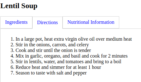
To illustrate: Imagine that I built a a site about recipes. It has sections about the 'ingredients', 'instructions' and 'dietary information'. I might like those to display on someone's screen as collapsible sections of the sort provided by <details> and <summary> in order to provide a a nicer design and a set of affordances for a user to consume the content more easily.
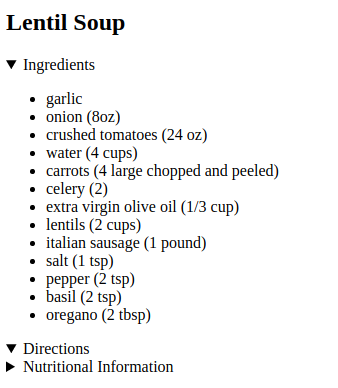
But really, at the end of the day, it's just that: A convenience of design affordance. As an author, in this case, I'd like it to print with all of the content, sans controls.
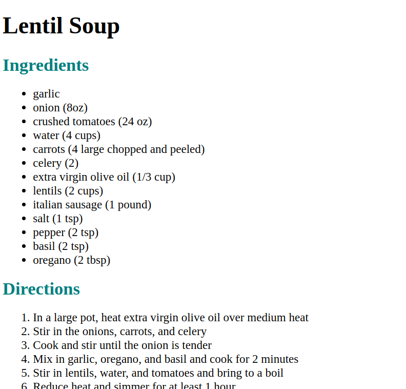
With <details> and <summary>, this is not an option. Their control-ness is hard-wired and fundamental. This feels like a mistake.
Interchangeability?
Unlike the collection of input which wants to describe a single "right shape", there isn't really a "right" answer to which of the things I have labelled Design Affordance Controls we should use. In the above example, one could easily and reasonably swap in several (maybe any) of them. Tabs, for example, are also a reasonable choice.
Because this is all in pursuit of design, it might even be desirable to even change our minds! "Responsive Tabs" which allow for a control to be presented as either "tab-like" or "accordion-like" based on design constraints aren't uncommon, and are an example of just this. Their existence helps illustrate that there are at least reasons to consider that this observation is relevant.
(There is a Note about "browser tabs" later)
UnControling?
Even outside of print, as an author, the answer to whether I'd like something to even provide <details> and <summary> affordances varies based on the design. This website, in fact, is an example.
If your browser window is big enough, the left side of this website (as of this writing, at least) is a bunch of information about me. It's not, very probably, why you're here. You didn't come to learn about me. You want to read the <main> content. But, that's not a design problem either... In fact, I think that showing you both and making it easy for you to get that information without being overly distracting is a feature of the design.
However, in a smaller viewport, this would become really inconvenient for a user. It would involve scrolling through a lot of "noise" in order to get to the actual content. The "easy" solution might be to just hide it. However, as I said, making it easy to find that information is a feature. So, on a small screen, I choose to put a disclosure widget that is collapsed by default with 'author information' in the summary.
Almost every website on earth, it seems, has some "spiritually similar" idea (hamburger menus, for example). Cool.
Except... wait... is it? That's not how the API surface of <details> and <summary> work. At all. I believe that's because of how we approached its design. I can't think of any precedent of a control that becomes... not a control. I can, however, point to plenty of examples of "regular things" that can potentially gain affordances.
Enhancing vs... Unenhancing?
Just as scrollbars "enhance" regular content with affordances, Progressive Enhancement does something similar. That's useful to think about.
Assuming that content should be meaningful and non-interactive to start is a good exercise, generally. Any of a myriad of problems can get in the way and if markup and styling implies something is interactive, but it doesn't wind up being so, users are left in one of two bad states:
- (ideally) a UI which seems to imply that a section could be collapsed, but frustratingly that won't seem to work.
- (much worse) a UI which seems to imply there is content (which their is) which the user should be able to expand, but frustratingly cannot.
This exercise is also potentially helpful in designing a new control like this for HTML itself. Until new controls are supported by every browser (and historically, that takes a long time), the situation is not dissimilar.
A more robust solution involves enhancing otherwise good and meaningful content (as you see in the print version above) with affordances, if that is both possible and desirable. In fact, this is precisely what several of the original PE examples/essays did. The essence of the element didn't change, only the affordances inside it did, and only if they could. They were perfectly good on their own, and were careful to avoid the above kind of situation.
But <details> and <summary> were not that. They were just unknown elements (effectively, <spans>s). They ran together stylistically, and they had no useful meaning to assistive technology either. If we had thought of these as "Design Affordances" which could appear on a <section>, how much better would that have been in the interim?
Clues in Linking and Searching?
Pages allow authors to share links to anchors. Find-in-page allows authors to find content in the page by searching. Today, this is a problem for <details> and <summary>, again in part because of how 'control-ness' is fundamentally baked into them. Again, this feels like a mistake, and these are pain points that we're working on - but it's interesting to realize that the same would be the case for other controls of this class if we continue to think of them this way.
I feel like these offer further evidence their UI affordances are necessarily secondary and not fundamental.
A Quick Note on "Browser Tabs"
Lots of interfaces that we use have things we'd all refer to in polite conversation as "Tabs". These are used as examples that confound a lot of conversations and take them in many directions. It's never the case, for example, that one would "print all the open tabs" or "view them all in a sequence". In fact, one could reply to many of the things I've written here with "...but, browser tabs...".
It's important to note that while we refer to all of these things as "tabs", most UI toolkits have entirely separate classes of "tab-like" things with distinct names. The fundamental distinction between them is that one of those kinds of tabs (the kind in browsers, chat clients, editors and so on) are actually managing windows, and the other kind is managing panels of content inside a window. On the web, our model is documents. But, there is an easy-to-imagine parallel with embedded documents here. That is, one could perhaps make tabs out of <section>s, or perhaps out of <iframe>s. These would have roughly the same kinds of boundaries as toolkits, but (even from a user's POV) actually different expectations on several of the things noted in this post.
Conclusions?
This post isn't actually intended to present a "solution" as much as it is to provide food for thought about how we shape the conversations as we design new things for HTML. Perhaps even toward helping shape answers to some long open questions. Even something as simple as "what is an accordion?" remains, believe it or not, just a bit elusive in some important ways that even the ARIA Practices Guide (APG) itself has struggled with. I hope that this line of thinking and discussion is helpful to that struggle.
In truth, it's probably not even this cut and dry. As I said: These controls aren't exactly like scrollbars either. I'm definitely not suggesting we should just match that either. It's tempting to kind of think of something like input's type attribute here - but it's not quite that either (which is good, because that is rife with issues -- see Monica's
Input I <3 you, but you're bringing me down. for a rough sense of them).
I'm currently working with lots of folks in OpenUI on trying to introduce some of these controls, and I'm hopeful we can incorporate these thoughts into our discussions. While this is a lot more to be fleshed out, there is a version of this that I can imagine that very closely resembles a proposal from Ian Hickson from long ago. Ian's proposal provided a wrapper element around otherwise good, sectioned content and would have offered minimal affordances (like grouping the headings as "tabs") and state management. There is a lot that appeals to me about that kind of approach and could play well here. A few of us (myself, Dave Rupert, Pascal Schilp, Jonathan Neal, Miriam Suzanne, Zach Leatherman, Greg Whitworth, Nicole Sullivan) have also been discussing bits of this. Some of us have also been working on creating a custom element along similar lines which can be plain old sections, "tab-like" or "accordion-like". This broke out from collaborative work that began with several of us attempting to align our ideas together on Pascal Schilp's Generic Tabs repository (that isn't the component, but it already has some nice qualities). I'm looking forward to sharing our component and more details soon.
Honestly, I'd love to hear your thoughts. I feel like this is an area ripe for serious R&D, study and discussion.
Special thanks to several friends for proofing/commenting on this as it developed: Alice Boxhall, Jonathan Neal, Miriam Suzanne, Eric Meyer, Dave Rupert. Thanks don't imply some kind of endorsement.