
Divs
I've been utterly failing to complete a couple of blog posts that I've been working on recently. As sometimes happens when I am writing, I have a semi-random but kind of related thought that doesn't really fit in the post and I tweet it instead. As it got some little attention/discussion, I'd like to expand on it here and offer a little more explanation/context.
Yesterday I tweeted a tweet about divs...
I wonder, seriously, if it was a mistake to make the meaningless element <div> only 3 characters long. Would we abuse it less if it was long
— вкαя∂εℓℓ (@briankardell) March 20, 2017
I'd like to share some context on that.
Let's imagine that you have a small contract to create a website whose whole aim is just to collect data. It's really just a few simple forms. If you wrote vanilla HTML without CSS for that and showed it to your client your client would probably immediately begin the search for your replacement.
It looks abysmal really. Unprofessional even.
And it's not just potentially complicated things like layout - even simple things like buttons look pretty terrible "out-of-the-box" by today's standards. From what I observe in practice it seems that a lot of people have decided that the default UA stylesheet is just kind of a terrible starting point for lots of things that we do.
So we turn to something like Bootstrap. Include Bootstrap's CSS and it immediately looks better.
Surpringly to many at first though is that it doesn't look that much better. Your buttons, for example, don't look like those fancy Bootstrap buttons.
That's because those "buttons" are actually painted based on classes. If you want your button element to look like a Bootstrap button you have to add classes ala button class="btn".
Now, before I talk about any more of this I want to stress something: Bootstrap is a tool. Tools want to be generally purposed - able to be used to solve many problems. Tools and parts kind of don't care what you do with them, they just are. Sparkplugs, batteries, wires and gasoline are all perfectly wonderful tools and parts and with them you can build lawnmowers and tractors and go carts and semi-trucks and - well, all sorts of useful things. You could also plug those things together directly and blow yourself up.
Bootstrap is a perfectly useful tool that you can use to build wonderful things. I'm not against it.
In fact, a great thing about something like Bootstrap is that it comes with some pre-defined and useful vernaular that doesn't exist in native HTML. The concept of a primary button for example. UIs frequently have a concept of a "primary" action. In our forms, "submit" or "next" is probably the primary action. In an email client or chat client "send" is primary.
The promise of CSS is really dependent on having more than just tags to work with. Part of the problem is that the standard vocabulary is quite limited and left to our own devices we'll just be all over the map. Many of us won't even think about the idea of "primary". The advantage of having some common "slang" with some good meanings like this is clear - people get in the habit of thinking about and identifying the "primary" action and marking it up as such. Just like the default UA stylesheet, Bootstrap gives it some kind of visual treatment "out-of-the-box". You can see how people appreciate this and how that isn't a bad thing at all.
Where I have seen this really bite us is when those things aren't entirely clear and we combine that with an over-dependence on tools. Tools like Bootstrap (this isn't unique to Boostrap in any way) enable people who don't know much about HTML or CSS to build a pretty nice looking sites and it's easy to take that a little too far.
So, the thing is: Bootstrap will let you attach those button classes to absolutely anything. Most of the time, the right answer is probably button class="btn btn-primary".
Here's why: The button element is suprisingly full featured:
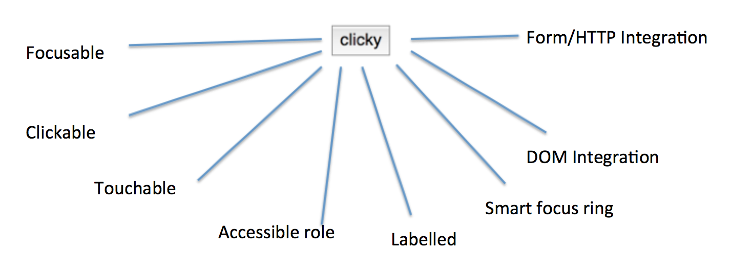
button is focusable, clickable, touchable and smartly integrated with DOM events, by default looks 'buttony', has the potential to integrate with form/HTTP automatically, has an accessible role and label and has quite a lot of smarts about how focus rings work and more - all "built in" - and this is an incomplete list. Buttons also have built in concepts like the ability to disable them and well-established meaning for that on all of these things.However, all too frequently, once a project is already completed I find something like this instead div class="btn btn-primary. Look, semantics are weird. Sometimes this can lead to you asking weird philosophical questions about which element you really should use and there isn't always a clear answer. But that tweet and this observation aren't a slam on divs either: They're a perfectly useful 'container' structure. You can use them to build structures that you can reason about more easily in your CSS and JavaScript. You should use them. I do. They just have absolutely no "meaning" at all - and in this particular case, it isn't really an especially philospocal question. Point to the thing on the screen and say "this thing" and immediately most people will say "the button?". It's a button.
When you use a div instead of a button, all of those things sketched above go out the window. You've got a lot of problems. It might "appear to work in a demo with the CEO" but there's lots of issues that are harder to demonstrate and explain and that's a terrible situation to be in.
Frequently, this isn't noticed until it's spread like a cancer. Buttons are one of the most fundamental building blocks of UI. You can't throw a stone without hitting a button, so remediating this late means touching your code in lots and lots of places. It might sound like a simple search/replace will fix you right up, but actually, those are quite different elements. Subtle differences chase you, and you'll be suprised at how many bugs will keep coming back from your QA department if they're doing their job well.
So, in the posts I'm currently failing to write I'm pondering the things that enable/reinforce us getting into these types of situations and why they are so terrible to find yourself in... and how to avoid them. It seems pretty evident to me that the gap is in large part about presentation and the power of 'demonstration' to shape things - but that's for those other posts....
What isn't clear to me at all is why so many developers seem to turn to a div in the first place instead of defaulting to using a button?
That's kind of a mystery, and all I can do is speculate.
One possibility is that perhaps if you think they "seem equivant" - one is shorter and looks less redundant?